A New Digital Hub For
Natural Resources’ Community
PROJECT TYPE
Contract Designer & Photographer
CHALLENGE
Merge two separate websites with well-thought-out architecture and functional interactions. Design the new digital hub with a heart and a sense of community. Create lifestyle images for Natural Resources’ new branding.
MY ROLE
• Product and User Research - heuristic evaluation, user interviews, usability testing, personas, affinity mapping.
• Architecture Design - Content prioritization, site map & navigation design, card sorting.
• Interaction Design - Sketching, wireframing, visual design.
• Brand Photography.
3 months.
DURATION
Figma, OptimalSort, Adobe Lightroom & Photoshop.
MAIN TOOLS

Overview
Natural Resources is a pregnancy, birth, and early parenting resource center & retail store, serving growing families in San Francisco.
For years, they had survived with a WordPress website created without any UX design in mind. The website was dated, unusable, with convoluted navigation and it didn’t have an online store, however, most of their customers and members made their purchases or reservations directly at the center.
When the pandemic hit and physical businesses had to close, their needs changed, having a functional website became a priority; they needed an online space where the community could access their services - vital for that stage of life.
As an emergency measure and from one day to another, they built an online store with the interaction and visual design that came by default in the Shopify template they acquired.
They soon realized that having an online store that was very different and separate from their original website was not helping them convey Natural Resources' message, nor was it helping them provide the resources that families needed.
My task was to unify both sites in a single and cohesive product following a user-centered process to guarantee the best user experience. Incorporate the recently redesigned visual brand.
Research
DISCOVERY PHASE
The first step was to get to know the Organization as deeply as possible. To achieve this, we went through a discovery phase that consited of:
1. A questionnaire with business, product, and user-related questions answered directly by the team I would work with.
2. A discovery meeting with the executive director and operations manager to define the goals and scope, know more about the Organization, current needs regarding design, users.
3. Connection with possible users (Natural Resource’s clients) who would help me with the research phase.
USERS
For a project with this scope, where a whole site required revision and redesign, it was important to have all the users in mind. Later on, we will focus on the primary users to develop specific flows and interactions.
WEBSITE EVALUATION
As important as understanding Natural Resources and its users, it is to analyze its digital products. I went through a deep analysis of the current offers, particularly the original WordPress website.
• The website’s architecture had grown organically, with no logical structure, resulting in multiple sub-navigations and very messy and not-intuitive flows that didn’t connect one with the other.
• The recently created online store was accessible only from a link on the homepage and would take you to a site that looked like another company’s store.
• The visual design was dated, with little contrast between text and background, small typography - very difficult to read.
• Extremely long user flows. Too many steps to complete a simple task.
USER RESEARCH
Methods & Goal
Usability Testing
- Find out if the existing product(s) is meeting the user’s needs (or how they are not meeting their needs).
- Analyze and understand people’s behavior and their interaction with the website(s).
User Interviews
- Develop empathy with the Users.
- Learn about parents or parents-to-be.
- Learn how users feel about the website.
- 3 past customers, now parents of toddlers.
- 1 potential customer, expecting mom.
- 1 no-customer, mom of a toddler.
- 1 no-customer couple and new mom. She gave birth at home with a midwife.
Testers
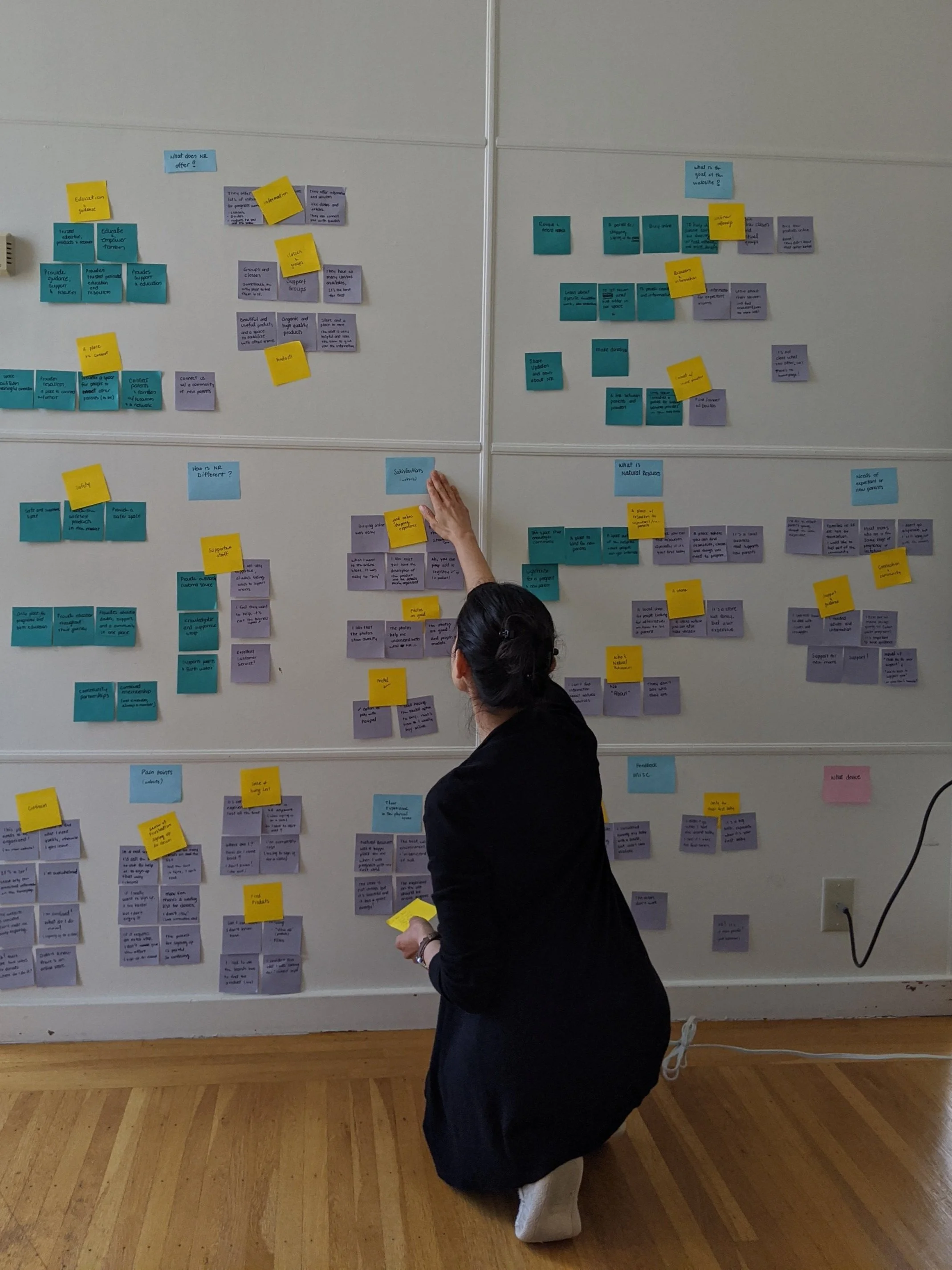
After the usability testing and user interviews, I consolidated and organized information in an Affinity Map and then analyzed qualitative data to extract my observations and insights.
INSIGHTS & OUTCOMES
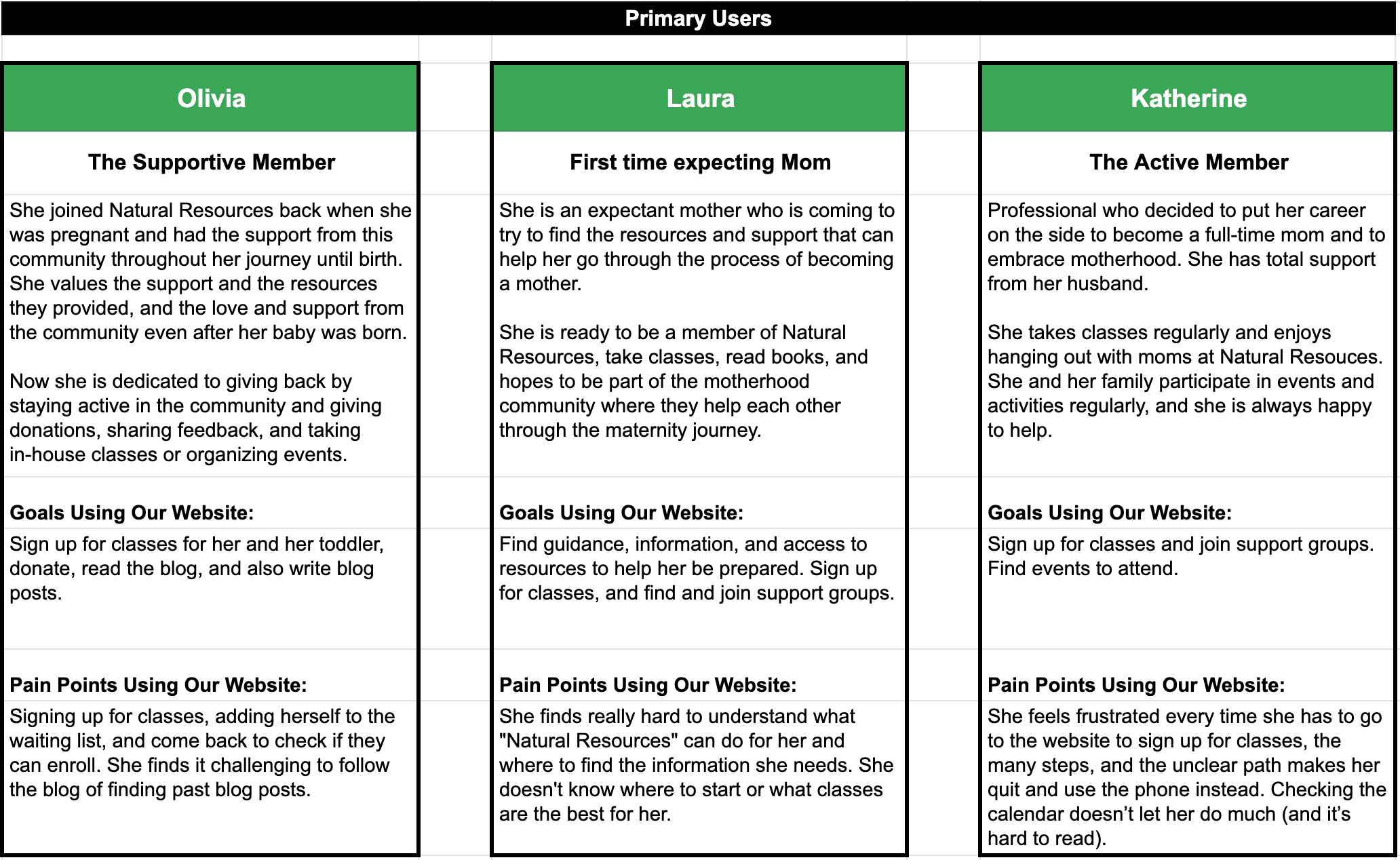
PERSONAS
After identifying the main usability problems and the actions we needed to take, I developed personas that would help me have their needs and pain points in mind.
Architecture
The most crucial phase of the project. It’s time to design the foundation where all the features and content will take place. Some of the methods I followed were:
• Content Prioritization -> MVP
• Product Categorization
• Card Sorting
• Sitemap iteration
CONTENT PRIORITIZATION
Research has given us the data we needed to identify the content and features the users would need. Many flows and interactions needed to be redesigned, but the timeline and resources required me to focus on those that were vital.
The whole team participated in creating the prioritization matrix and establishing the features to be developed.
In the future, with the website up and running, we could collect feedback to make improvements and then expand based on that.
BLUEPRINT OUTLINE
Structure and layout
The team debated in going with the same approach they had on the original website, more traditional sitemap, or go to a targeted approach, where users would follow a specific path depending on the stage they were: Expecting parent, parents with a newborn baby, parents with toddlers, or the path for doulas/prospect doulas.
I created one sitemap for each; they reviewed and tested them internally.
Selected Sitemap
I managed to create one with a blend of both approaches. The base would be the traditional approach, and the pathways would be accessible from the homepage or an additional menu.
MEGA MENUS
The structure is ready. Another essential part of the architecture would be categorizing the navigation menus. Because they already have a Shopify online store, they wanted to integrate some of the e-commerce platform's features into online stores, but the whole design could benefit from it. The most prominent feature would be the mega-menus.
Using OptimalSort, I conducted an unmoderated card sorting study to categorize the online store categories based on the users’ mental models.
Design
WIREFRAMES
First iterations
Paper sketches were tested internally.
Digital Wireframes
After a few modifications in the flow and the design of the interface, I created the digital, still low-fi wireframes to be able to test with the users.
USABILITY TESTING
Time to test the wireframes. I prepared different flows with the same users that tested the original website at the beginning of the project.
• 3 past customers, now parents of toddlers.
• 1 potential customer, expecting mom.
• 1 no-customer, mom of a toddler.
• 1 no-customer new mom. She gave birth at home with a midwife.
→ Rent a TENS machine.
→ Find information about doulas.
→ Book a class for toddlers.
→ Discover Natural Resources’ benefits.
THE RESULTS
5/6 found their way quickly and without any complications.
6/6 like the design and found it to be much more intuitive.
5/6 felt confident using it and said they would go to the site to book classes, find additional information and connect with other parents.
THE LAST TWEAKS
With the usability test, we realized that testers looking for rentals went directly to shop. The team agreed that it would be more intuitive to merge the Shop and the Rent flows into a single front page.
* The website will be monitored and tested after a few months.
VISUAL DESIGN INTEGRATION
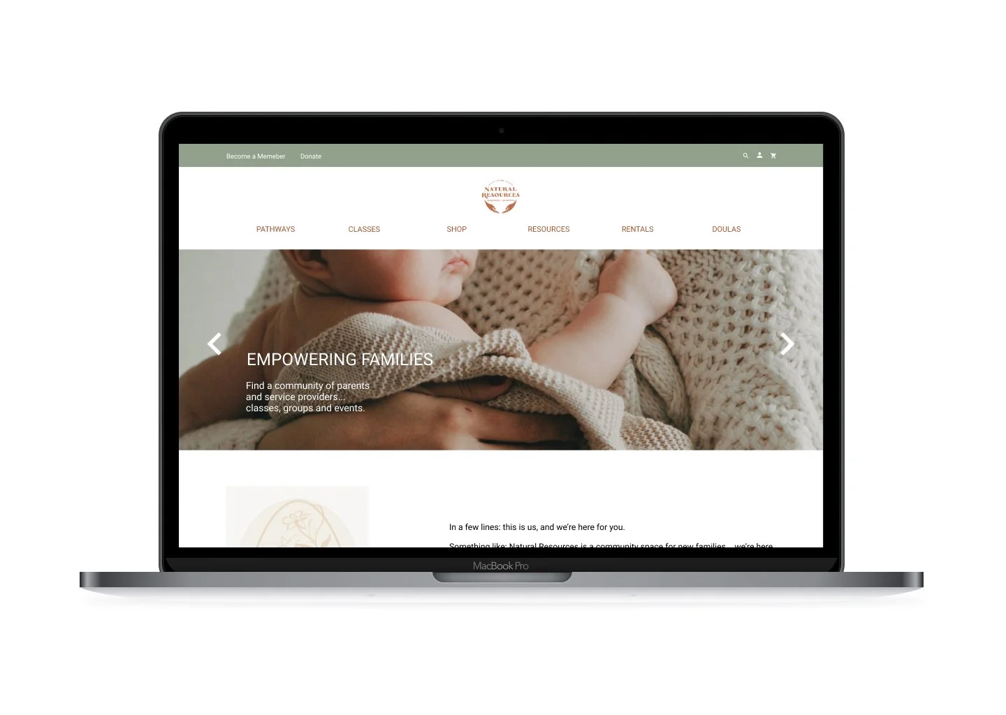
Following the new brand guide, I implemented the visual design to give life to the website. The colors and illustrations were only a recommendation. I also took lifestyle and product photographs that you can find in my Brand Photography gallery.
• The Look & Feel - ORGANIC, NATURAL, REAL.
• The Color Palette - WARM, EARTHY, SOFT.
BEFORE & AFTER
Comparing the final result and the original site.
A side-by-side comparison of the main pages.
The Result
• A well-organized site with easy access to information and resources.
• Photography of the center/store and its products, based on the renewed branding.
• Cohesive images for their product collections.
• I started the implementation of the design in Shopify (volunteer work).
Final Thoughts
• Implementation of the design is still in process by Natural Resources.
• NR is interested in you doing other lifestyle photoshoots when it is possible to have in-person classes, and there is more interaction in your space to reflect human connection.


